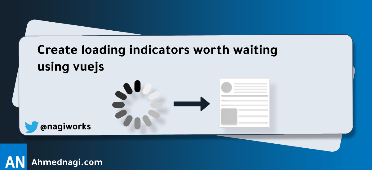
Create loading indicators worth waiting using vuejs
In this short blog/tutorial We'll look into how to create friendly UX loading indicators aka skeleton loader.
# Why? (Theory)
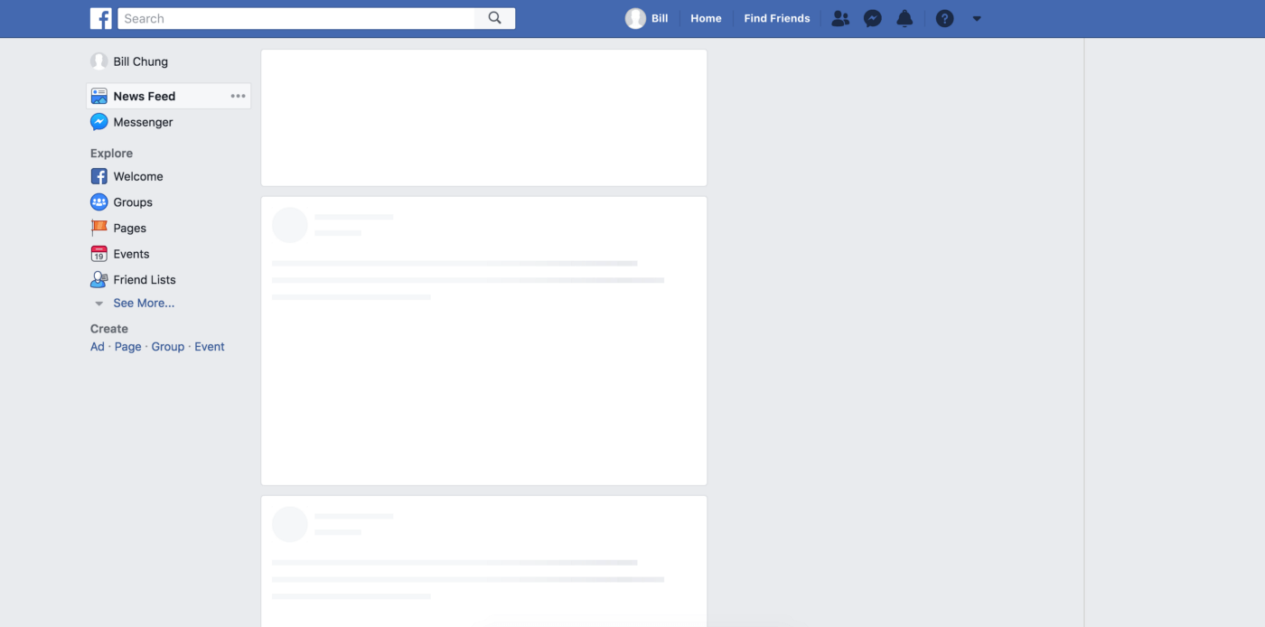
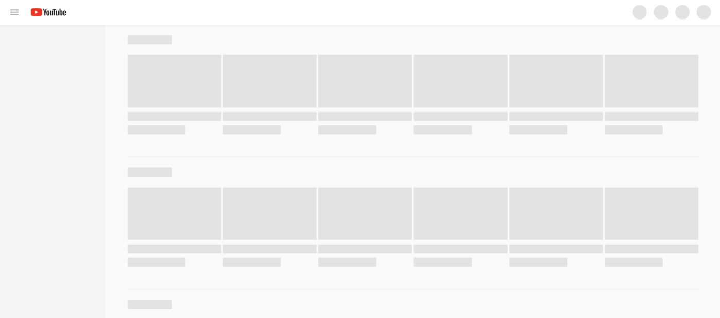
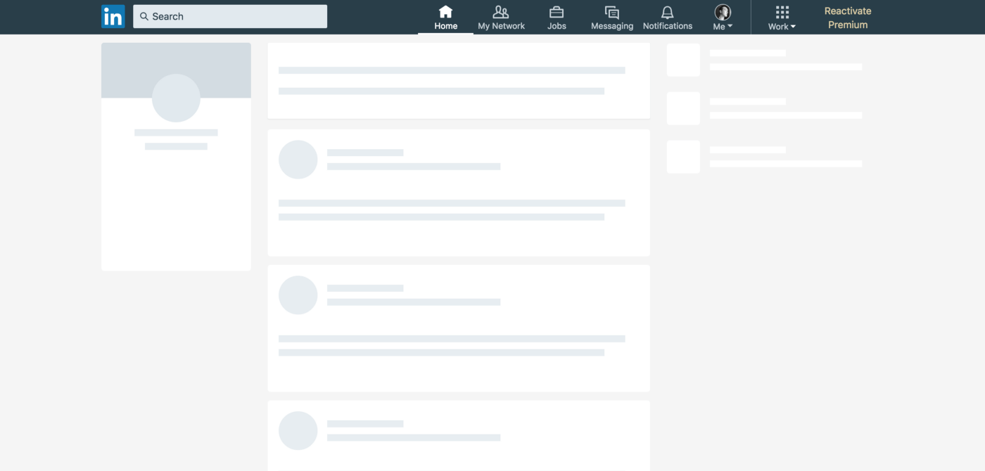
When you visit YouTube or Facebook, usually the page takes a moment to load, at this moment you don't stare at a blank white screen. These sites utilize a UX pattern called "skeleton screen" to fill the gap in the user's mind.
Previously designers used spiners to indicate time is ticking as LukeW Ideation (opens new window) describes in his famous blog post Avoid The Spinner (opens new window) 👇
“We had made people watch the clock… as a result, time went slower and so did our app. We focused on the indicator and not the progress.”
Let's do this...
# Examples
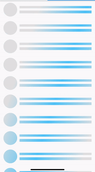
# YouTube
# Concepts
# Size
Contents should replace skeleton exactly by position and size immediately after they are loaded.
# Animation
Use animation that moves from left to right (wave) to give a better perception of decreased waiting time than fading in and out (pulse). Because using animations that is slow and steady gives a perception of decreased waiting time.
# Colors
When designing Skeleton Loader for image gallery or group of related elements, try to provide a context to elements that are loading by using the dominate color as the base for the loading image instad of the using one color for all.
You can spot this pattern in Google Images.
# Let's Code
In this tutorial I'll be using Vuejs and a npm package called vue-skeleton-loader (opens new window), it's the easiest and fastest way to get started. Plus it emphasizes the concepts we discussed earlier.
👋 Don't worry same concepts apply for other frameworks as well.
# Install the package
- npm:
npm install skeleton-loader-vue --save - yarn:
yarn add skeleton-loader-vue
# Register it in your component
<script>
import VueSkeletonLoader from 'skeleton-loader-vue';
export default {
  components: { VueSkeletonLoader },
};
</script>
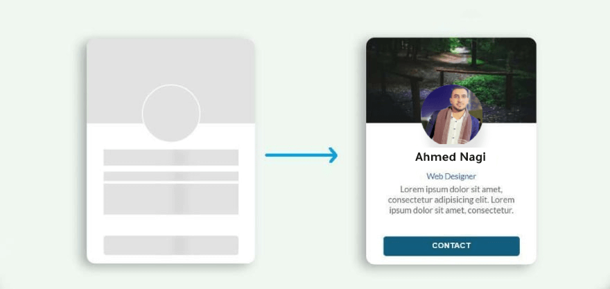
# Let's create a skeleton for this profile card
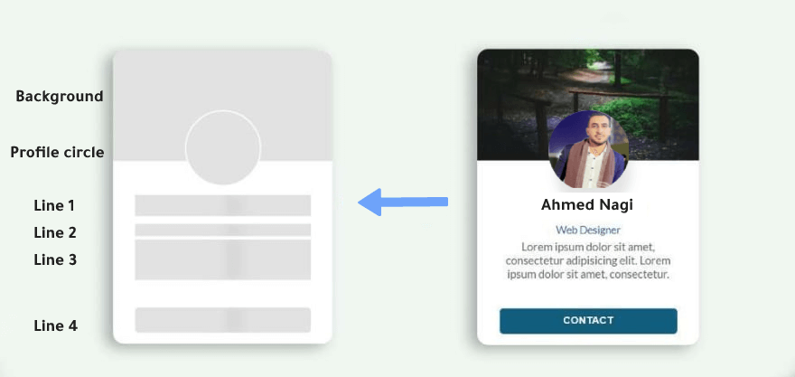
This card is contains 1 circle and square for every line and the background 👇
<template>
  <!-- Card Body -->
  <div class="profile-card">

    <div class="profile-header">
        <!-- background  -->
        <vue-skeleton-loader
        type="rect"
        :width="250"
        :height="150"
        animation="wave"
        wave-color="rgb(150,150,255)"
        />

        <!-- profile image  -->
        <vue-skeleton-loader
        type="circle"
        :width="200"
        :height="200"
        animation="fade"
        />
    </div>

    <div class="profile-info">
        <!-- First line  -->
        <vue-skeleton-loader
        type="rect"
        :width="100"
        :height="20"
        animation="wave"
        />

        <!-- second line  -->
        <vue-skeleton-loader
        type="rect"
        :width="100"
        :height="10"
        animation="wave"
        />

        <!-- third line  -->
        <vue-skeleton-loader
        type="rect"
        :width="100"
        :height="20"
        animation="wave"
        />
    </div>

  </div>
</template>
I didn't include any styling since you can use any framework or even pure CSS to structure items using flex.
# 💡 Tip: Couple the skeleton loader with the component
I like to to put the skeleton loader with the actual component and toggle between them with piece of state like isLoading 👇
<template>
    <div>
        <!-- profile card skeleton component -->
        <profile-card-skeleton v-if="isLoading" />

        <!-- Actual Card Body -->
        <div v-else class="profile-card">
            <div class="profile-header">
                <!-- Profile card code ... -->
            </div>
        </div>
    </div>
</template>

<script>
export default {
    data() {
        isLoading: true,
    },
    mounted() {
        axios
            .get('/endpoint')
            .then(res => {
                // do your thing ..

                this.isLoading = false;
            })
    },
}
</script>
Now whenever the component is loading it'll show the loading skeleton. Neat right!
# When to use and When not to use
# Use
- Use on high-traffic pages where resources takes a bit long to load like Crud table.
- When the component contains good amount of information, such as List or Card.
- Could be replaced by Spin in any situation, but can provide a better user experience.
- Use when there’s more than 1 element loading at the same time that requires an indicator.
# Not to use
- Not to use for a long-running process, e.g. importing data etc.
- Not to use for fast processes that take less than 300ms.
That's it for now, Keep up the good work!