The Extensive Guide to Create Beautiful Social Media Headers Using Tailwindcss
Today I'll walk you through how I created beautiful headers for my Twitter and LinkedIn profiles that represented me the best, and how you can get started creating your own easily.
This guide is less about theory and more about actions. Enjoy!
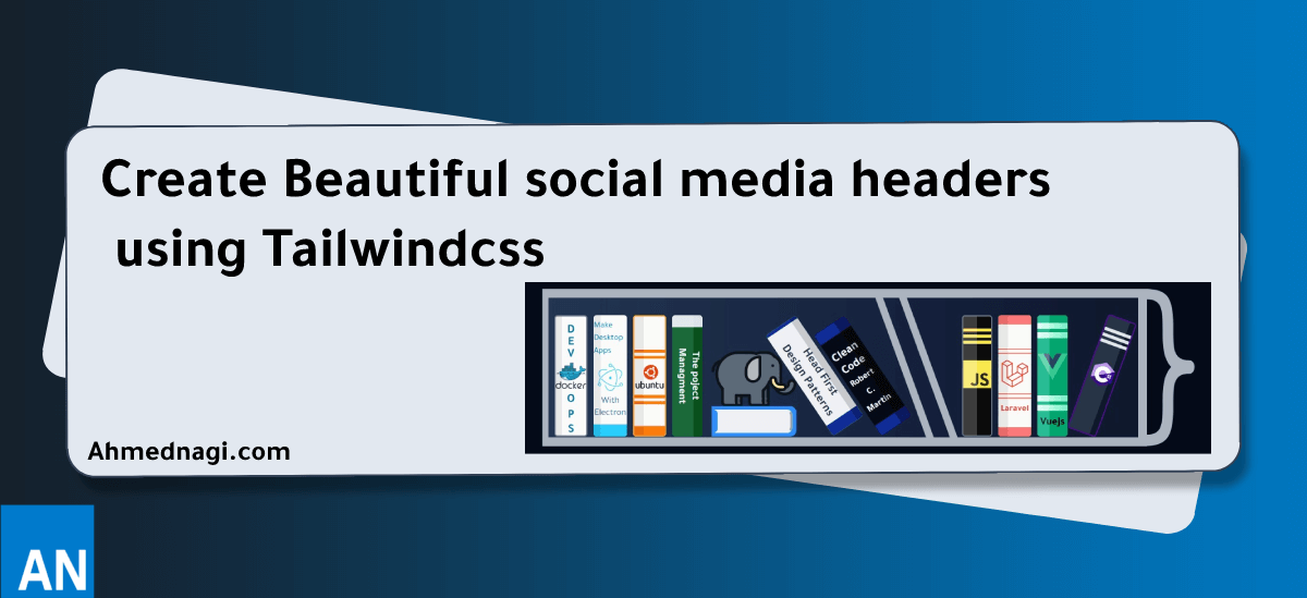
# Headers like this ones 👇
# Why creating custom header matters
Pratham @Prathkum (opens new window) kickstarted his tech journey by learning CSS in public through creating his Twitter headers with CSS. Time went by, and he built an audience around this idea.
I think his success was due to representing his personality and knowledge on his Twitter header. This is what we'll try to achieve here; building an online presence and personal branding using social media, especially his twitter header.
# Getting started
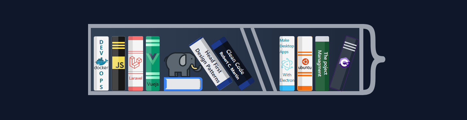
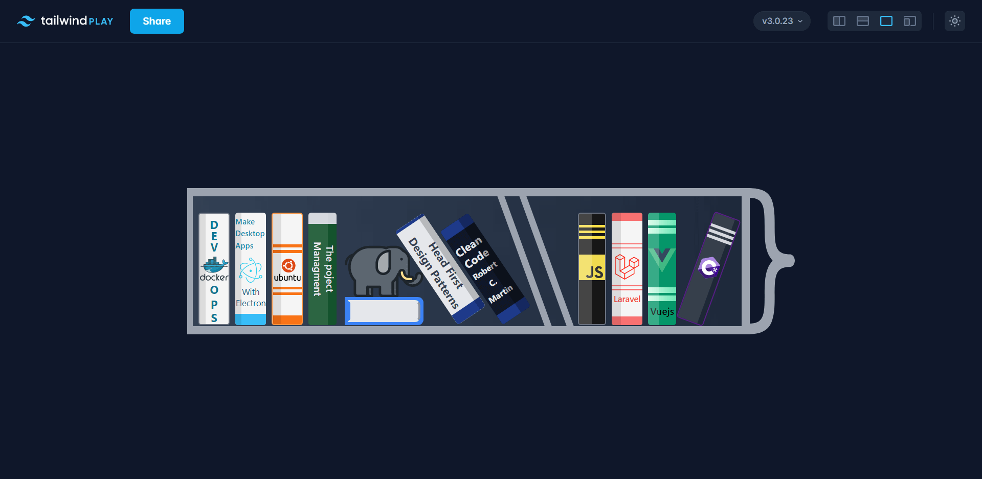
First, we need to brainstorm ideas for that perfect header and let me walk you through my personal experience creating my latest header the programming books header on Twitter (opens new window).
# Brainstorming ideas
- I'm a visual person I get inspired by images, so I went to Google Images (opens new window) and typed in the search book
Web developer Twitter headerand here are some of the results:
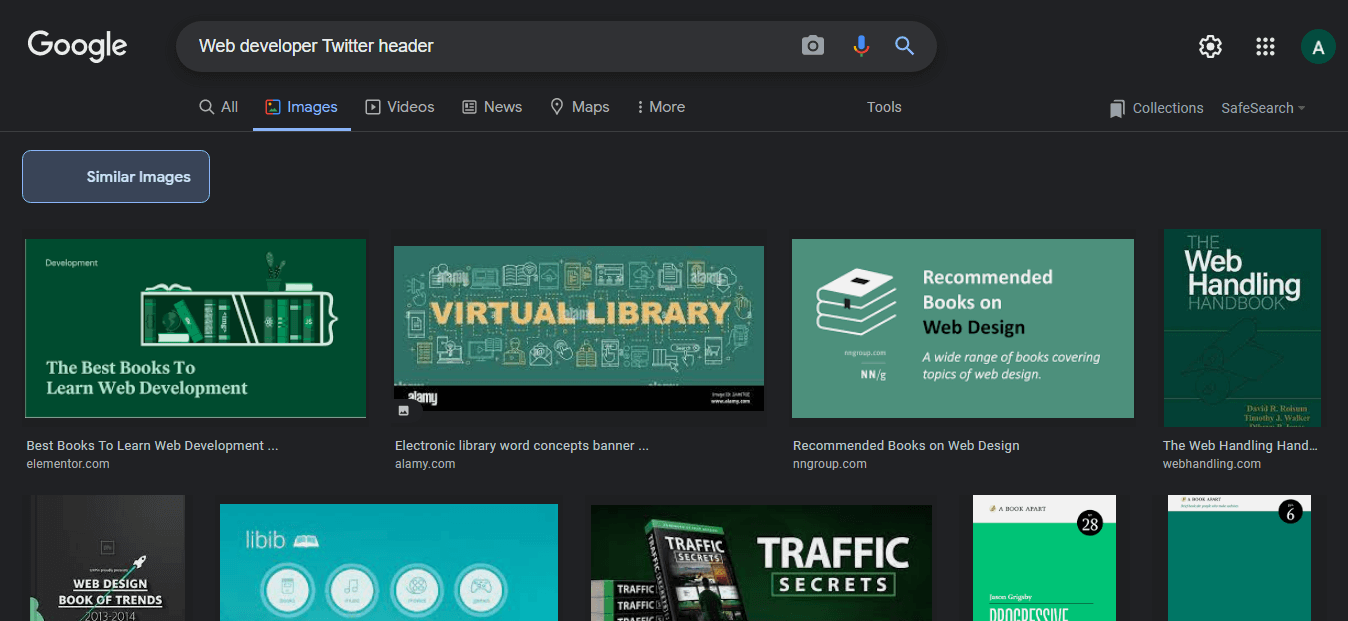
I spent a healthy amount of time, around 20 mins, looking at these images until this image caught my attention 👇
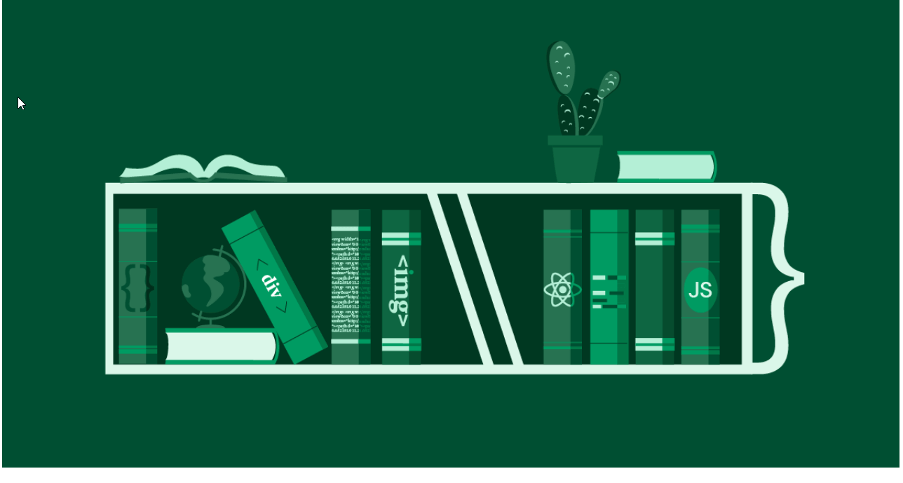
Then had this idea to put the programming languages and the technologies that I know and love on a bookshelf. Effectivity showcasing my experiences indirectly.
# Getting up to work
I find myself reaching out to the easiest and simplest tool in my toolbox whenever I have an idea or inspiration, or even sketch something quickly. Tailwindcss's Play (opens new window) was the most convenient in my case.
Tailwind Play has an instant refresh feature that helps with productivity quite a lot.
# Colors
Colors is the most element appealing to the eye, so it's important to spent time matching and comparing colors.
🔥 Hot tip: Tailwind CSS official color palette is the best place to find and match color variants. Visit the Docs
I love the darker shades of gray 😉 #0f172a so I started experimenting a with the this color.


# Define the easiest part and start with it
Besides starting with the simplest tool, I like to start with the easiest part of the project, which helps me to do more and stay motivated. It's important to keep any frustrations away when getting started.

Here ☝ I was experimenting with the colors. The easiest parts were the books and the curly brace } that attached to the shelf's right-hand side. I decided to use SVG for } and for all of the logos.
# Play some music
Creating art requires a mood. I played my Mood Playlist to help me relax and get into it.
# Organize your code using comments
Working with large HTML chunks and remembering where is every closing tag is a pain in the ass. I like to put comments on every element defining what it represents, where it starts, and where it ends. see the code snippet bellow 👇
          <!-- Book  Docker-->
          <div class="relative h-full overflow-hidden border-2 border-gray-500 rounded w-11 bg-neutral-100">
            <!-- Logo and lines container -->
            <div class="flex flex-col justify-center w-full h-full">
              <!-- Letters above logo -->
              <div class="absolute w-full h-1 font-bold text-center text-cyan-700 top-1">D</div>
              <div class="absolute w-full h-1 font-bold text-center text-cyan-700 top-5">E</div>
              <div class="absolute w-full h-1 font-bold text-center text-cyan-700 top-9">V</div>

              <!-- Docker logo -->

              <!-- letters bellow docker logo -->
              <div class="absolute w-full h-1 font-bold text-center text-cyan-700 top-24">O</div>
              <div class="h-1 w-full text-center text-cyan-700 font-bold absolute top-[7.3rem]">P</div>
              <div class="h-1 w-full text-center text-cyan-700 font-bold absolute top-[8.5rem]">S</div>
            </div>

            <!-- Overlay: Shiny layer like a shadow -->
            <div class="absolute inset-0 w-[20%] h-full bg-black/10"></div>
          </div>
          <!-- End of Book Docker -->
Sticking to this approach made it incredibly easy and convenient to copy and paste HTML chunks/components, without ever feeling lost or debugging unclosed tags for hours, causing the task to be frustrating and boring!
# It doesn't have to be complicated
The goal here is to have fun while building your brand i.e. social media headers. I always use the technique or technology that I find most enjoyable and convenient.
# Flexbox almost everything
I prefer using Flexbox whenever possible. It's easy to use, providing more enjoyable ways to manipulate elements. Even Tailwindcss provides convenient ways to space elements evenly with utilities like space-x-2.
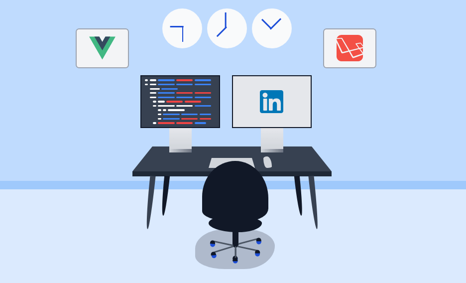
See the following snippet (is for the left screen for the office header) 👇
      <!-- left screen -->
      <div class="bottom-[6.5rem] absolute">
        <div class="relative w-48 h-32 left-5 bg-gray-700 border-[3px] border-gray-900">
          <!-- Sreeen content -->
          <div class="relative flex flex-col justify-between w-full h-full p-2">
            <!-- first line -->
            <div class="flex items-center w-full space-x-1">
              <div class="w-2 h-1 bg-white rounded-xl"></div>
                <!-- More code... -->
            </div>

            <!-- second line -->
            <div class="flex items-center w-full space-x-1">
              <div class="w-2 h-1 bg-white rounded-xl"></div>
                <!-- More code... -->
            </div>
          </div>
          <!-- Stand -->
          <div class="h-[3.3rem] w-[3.4rem] bg-gradient-to-b from-gray-200 to-gray-300 absolute left-[4.2rem] top-[7.8rem]"></div>
        </div>
      </div>
# Useful tools under your built
Here are some free, publicly available tools that helped me with some complicated parts:
# Fancy Border Radius
I admit that I cheat a little about only using Tailwindcss to create my social media headers, sometimes curved weird-shaped objects are difficult to draw with just a couple of CSS classes.
Fancy Boarder Radius (opens new window) Is online, free and opensource tool to shape flexable corners.
Super easy and elegant to use with tailwind CSS. I used it to draw the chair and the mouse.
See the snippet below 👇
  <!-- chair container -->
  <div class="relative">
    <div class="absolute top-[17rem] right-[-5.5rem]">
      <div style="border-radius:71% 71% 43% 54% / 85% 89% 29% 23%;" class="w-40 bg-gray-900 h-36"></div>
      <div style="border-radius:50% 50% 50% 50% / 50% 39% 61% 50%;" class="w-32 h-10 ml-4 -m-3 transform bg-gray-900 rotate-2"></div>
      <div class="absolute left-[4.6rem] w-[0.9rem] h-12 rounded-xl bg-gray-900"></div>
    </div>

    <!-- Other code -->
 </div>
# SVGREPO
Free to use SVGs for the brands and objects that are hard to draw.
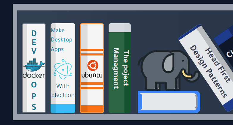
I get this cute little elephant from svgrepo 👇
Some SVG will generate quite large code. Checkout the next tool to help you solve this problem!
# SVGOMG: Optimize your SVGs
My most favorite SVG tool ever. Free and open-source because some detailed SVGs have huge HTML that can make your code looks messy and hard to edit. Plus, you get to save size using this tool!
# Tailwindcss official docs
As I have already mentioned in the Matching and Comparing colors section above, Tailwindcss docs have all the available colors beside some recommendations on color matching.
# High resolution display monitor
Having a high resolution and color-accurate display is crucial to draw a nice header. I recall using my laptop old display to draw my first ever CSS header it was a complete disaster 😂 👇
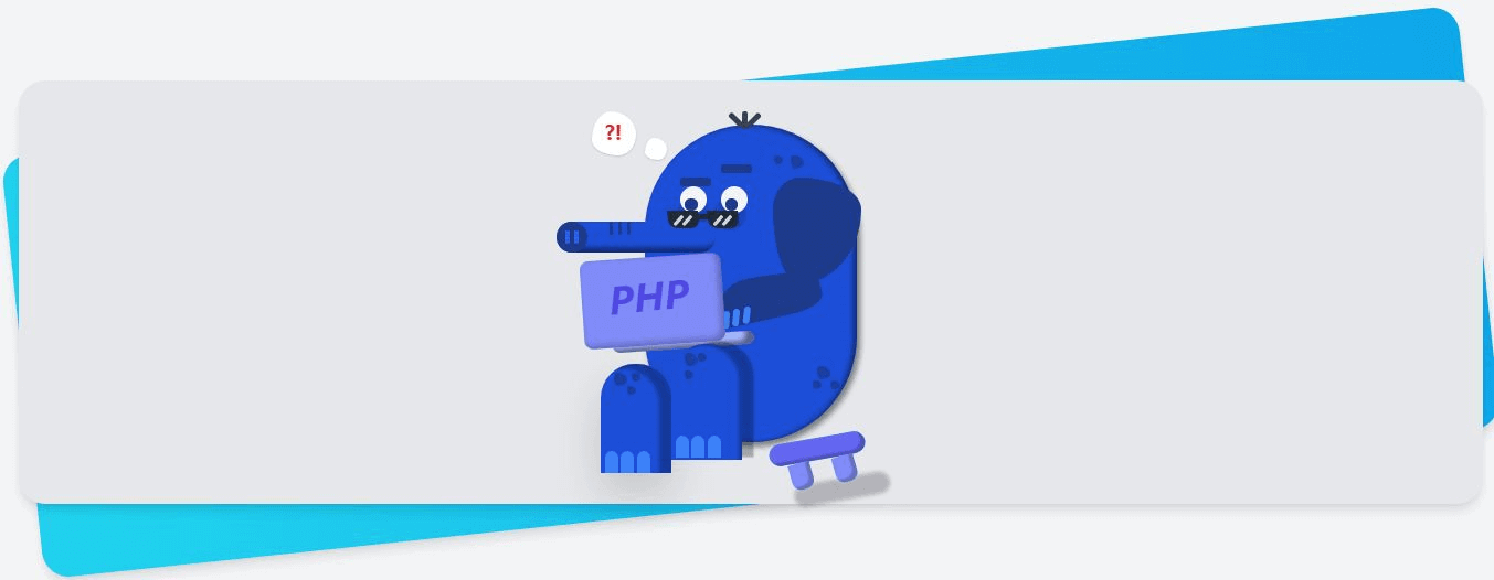
I didn't notice how bad it was until I viewed it from my iPhone. I quickly fixed it though 👇
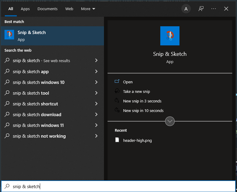
# Windows 10 cutter tool
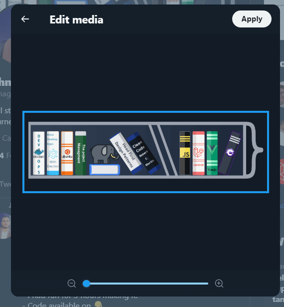
After building the header, you'll need to convert it to an image preferably png to share it online.
I love this tool because it is free and does its job perfectly taking high-resolution screenshots.
If you use Windows 10 you can find it pre-installed by searching on Snip & Sketch.
# Free Image Resizer
This tool helps you resize the header exactly like what the platform wants. Free and easy to use.
More on how to resize the header to fit the social media platform sizes in the next section.
# Resize the header to fit perfectly
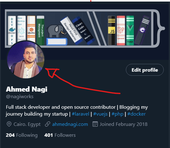
You could spend hours drawing your header then get ruined by your own profile image!
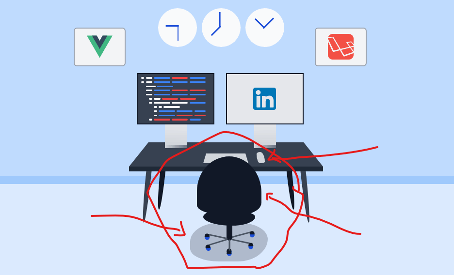
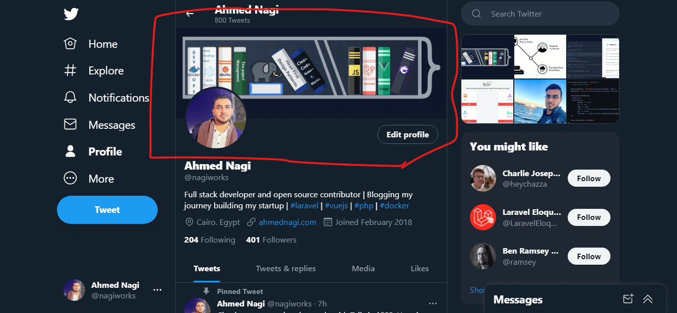
Look at what happened to my header on linked in the header. (Side note I think linked in the header is way too small) 👇
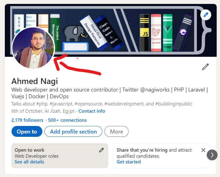
In this case, there's little you can do because the Linkedin header is small. I moved the important books/skills (Js, Laravel, Vuejs) to the right to be more visible. Every case is different; the point here is to account for it while designing your header.
In twitter it was a bit different I took a bigger screenshot 👇
# Open your play ground or your html in full screen
# Take a screenshot from little bit far (keep margin)
This will give you more space to zoom and cut 👇
The end result on twitter 👇
# Don't forget to share your creative ideas
After finishing your awesome header and updating your profile, don't forget to share a post explaining the idea behind it and what is the cool technologies used to create it. Share and learn in public with the community and let them know how awesome your ideas are.
You are welcome to share your ideas and headers with me on Twitter @nagiworks (opens new window). If you need help getting started, don't hesitate to reach out and say Hi. My email hi@ahmednagi.com.
# Warpping things up
- Building your online presence and personal brand requires creativity, and creativity is something we can learn.
- It's fine to use pure CSS but I recommend using Tailwindcss you'll enjoy using it I guarantee you!
- Don't forget to share your awesomeness with the community!
Keep building even if there's no one watching!