The 1 tool you'll ever need to improve your results
# Jump to sections
- Jump to sections
- A little story
- The Bigger Picture
- Hill Charts
- Why I decided to use hill charts
- Implementation
- In the End: A Better prospective
# A little story
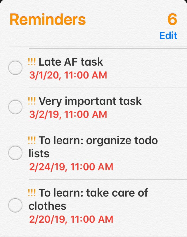
I was going to work everyday with one thing on my mind; how far are we in the project? It was huge and there was just 4 of us, me as a team leader I had to ask this question everyday and we as a tem have to answer it as well. Some of the tasks were lengthy and huge, it was daunting to keep track of what was done and what was about to finish using our regular todo app. At some point it was clear that we need some sort of a tool that will help us visualize our progress and help us see the bigger picture.
# The Bigger Picture
They say pictures express 1000 words. I needed to know in what stage are we in a particular task with only one glance. Entering Hill Charts (opens new window).
# Hill Charts
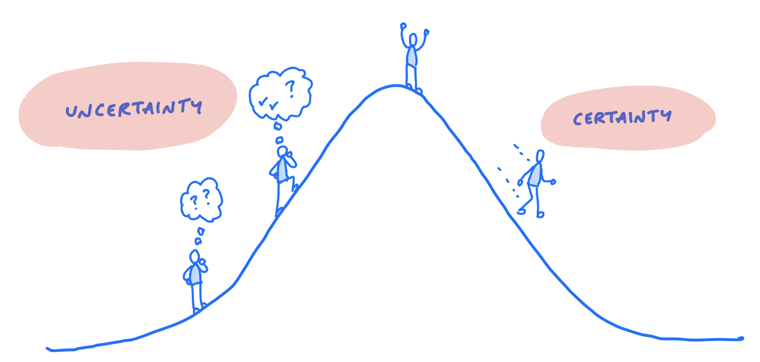
As Basecamp describes It 10,000-foot view of projects that answers the hard questions about where things really stand. Every piece of work has two phases. First there’s an uphill phase where you figure out your approach. You have a basic idea about the task, but you haven’t figured out what the solution is going to look like or how to solve all the unknowns.
Eventually you reach a point where there aren’t any more unsolved problems. That’s like standing at the top of the hill. You can see clearly all the way down the other side. Then the downhill phase is just about execution
# Why I decided to use hill charts
# Compact
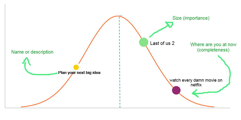
Everything you need to know about a task, name or description, importance and how deep are you in trouble (completeness). It answers 2 basic but importnat questions:
- Is the project going to be done on time?
- Am I stuck?
# Uncertainty simplified
In early stages of working on a task you'll climb the hill where you figure out your approach. You have basic idea about the task, but you haven’t figured out what the solution is going to look like or how to solve all the unknowns.
Eventually you reach a point where there aren’t any more unsolved problems. That’s like standing at the top of the hill. You can see clearly all the way down the other side. Then to the fun part, down-hill phase is just about execution.
# More information than you think
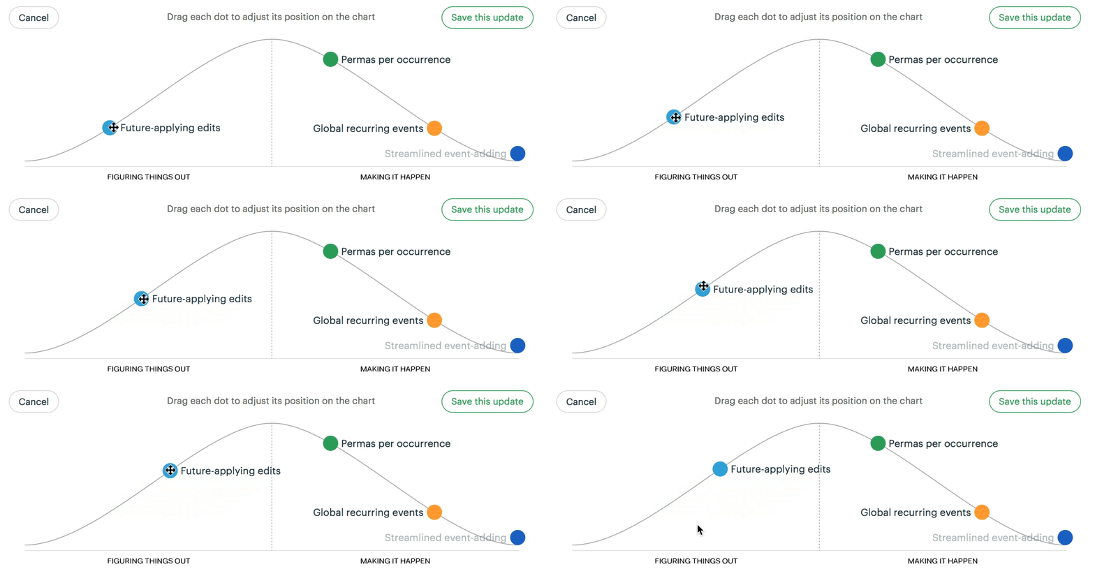
We humans are visual creatures, we can extract more information from visual elements more than verbal or written ones for example if you spot one dot on the chart that isn't moving for some period of time that gives you hints that you might want to re-think execution or divide the task into smaller parts.
What I like even more about hill charts is that the status is human generated, not computer generated. This reflects a real person’s feeling of the work at this moment.

# Start small grow large
Most of us specially developers tends to get a head of themselves and think about final results asking what will the finished product will look like. Hill charts are designed to visualize task lists not individual tasks, so we can divide large tasks into individual, smaller, and focusable tasks. By focusing more on a single task we maximize and optimize the time devoted for it, creating what's called Snowball effect.
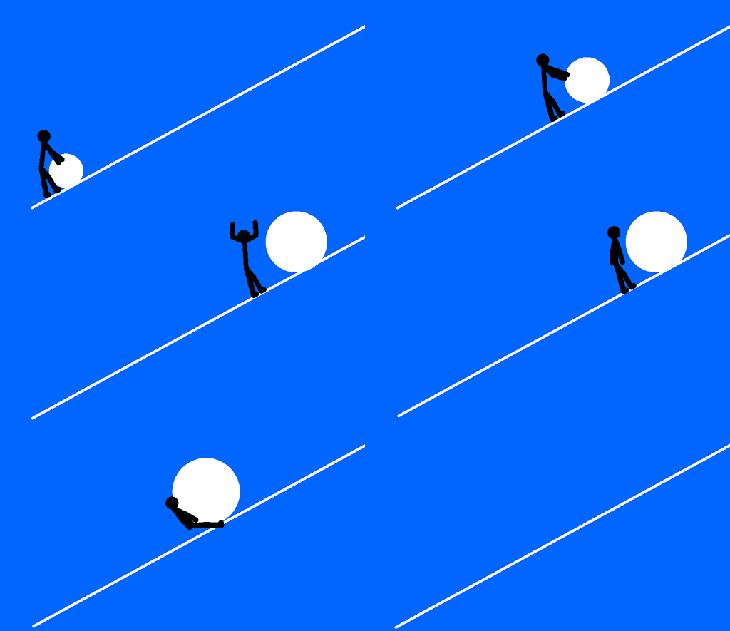
Climbing the hill in the first half is hard and time consuming, once we reaches the top of the hill we'll start to form better ideas and execution plans to complete the task which gets us down the hill even faster.
# Implementation
Since Hill chart isn't a separate app or I took the time to re-impalement it using javascript and d3.js.
Curious how it works under the hood? Read my blog on How I build a tool to visualize todo lists.
You can find the implementation on github.com/nagi1/hill-chart (opens new window) 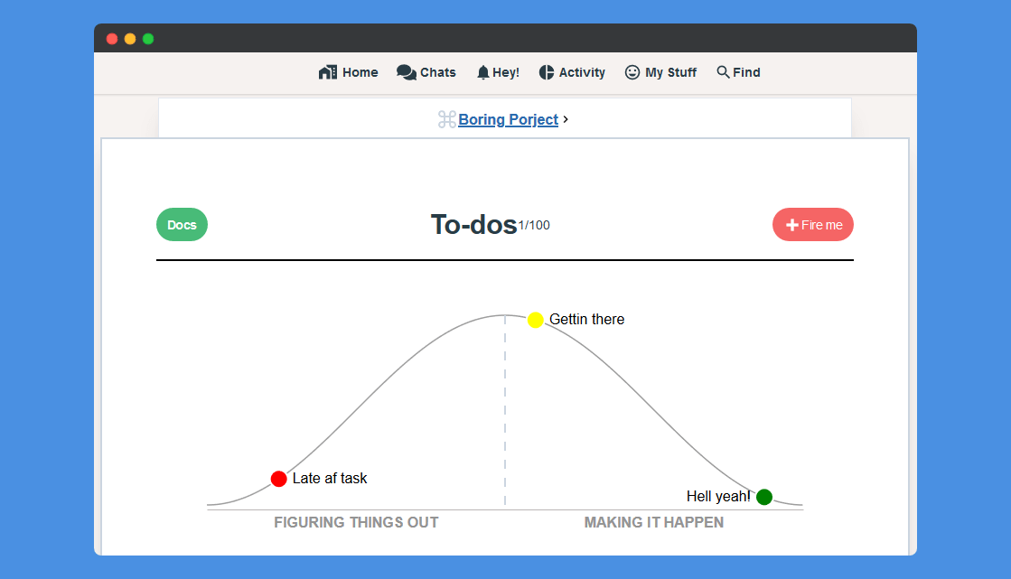
# In the End: A Better prospective
Hill charts changed my way of thinking about progress at a level never before possible. Now I have a way to immediately see where things stand. It’s no longer a challenge to see what’s in motion and what’s stuck and need more work.
